Tuesday 23 December 2014
Thursday 21 August 2014
Dashboards in Microsoft Dynamics CRM 2013
Dashboards
Dashboards in Microsoft Dynamics CRM provide an overview of business
data ‒ actionable information that is viewable across the organization. Create
dashboard components that help you find and analyze important data.
You can create two types of dashboard:
- User dashboards. An individual user owns a user dashboard. It can be assigned to other users or teams. A user dashboard can be set as the default dashboard for individual users. A user dashboard overrides the system dashboard for the user.
- System dashboards. A system dashboard is available to all users in the organization, and can be set as the default dashboard for the organization. Importing, exporting, or uninstalling a solution applies the relevant actions on the dashboards.
Dashboards collect your
organization’s most important information in one place, in an easy-to-read format. Use a dashboard to gain insight in real time, and then take appropriate
action.
Components of Dashboard :
- Chart: Graphical representation of a particular set of data. Records returned by the view of the entity type can be totalled or listed within a pie, bar, funnel or line grap
- List/Grid: Allows insertion of individual views of entities into the Dashboard, such that multiple different entities and/or views can be displayed to the user as a single view of the CRM Areas that relate to them
- iframe: Use an iframe to display a webpage or to run a web app. You can use an iframe to refer to sources outside your domain
- Web resource: Use a web resource to display an HTML page or an image, or to run a Silverlight application or JavaScript code. Web resources are stored on a Microsoft Dynamics CRM server.
Dashboarding Capabilities
- Embed reports inside dashboards using iFrame
- Enable security roles
- Set default dashboards to display
- Customize width & height of each component
- Share dashboards with other users
- Drill down a chart inside dashboard
- Mobile dashboards
A Sample Dashboard in CRM with 6 components


Different states of Opportunity, Quote, Order and Invoice in Microsoft Dynamics CRM Online Sales Process

2. When we create a quote from opportunity, the
quote goes in Draft state. Click
Activate Quote to make it active


4. When we
click create order, we close the quote with state as Won and also we have the option to close the opportunity as Won or leave as it is

5. At this
stage the order is in Active state.
Here we can either cancel order so that it goes in Cancelled state or create invoice from this order

6. Once
clicked on create invoice, it goes in Active
state and we have the option to cancel invoice (Cancelled state) or invoice paid (Paid state)

7. Assuming we
fulfilled the order and paid the invoice, the state for order changes to Fulfilled and invoice to Paid


8. Similarly
we can check the final states of Opportunity, Quotes and Orders


Capabilities of Charts in Microsoft Dynamics CRM Online
Different
Capabilities of Charts in CRM
 2. We
will combine the multi series chart to create a single series chart and will
change the color palette to make it look different. Palette color here is
Bright.
2. We
will combine the multi series chart to create a single series chart and will
change the color palette to make it look different. Palette color here is
Bright.

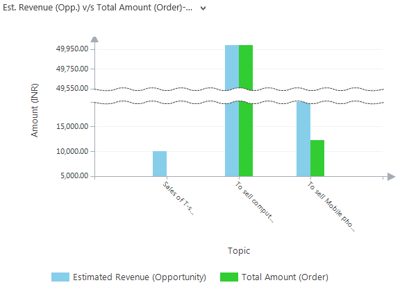

Here
we have a basic chart which shows Estimated Revenue from Opportunity v/s Total
Amount from Order. Then later we will modify the XML to show its charting
capabilities.

1. We
will modify the title of both the axis as well as of legend and will remove the
label from the top of column. Also will increase the font size for overall
chart. The output chart after modification is as shown below
3. Now
we will make the chart more readable and attractive by modifying the label and
arrow style.
Also
will with the margin to make it more understandable. 
4. We
can also break the scale of a chart when it contains higher range values. Also
we can step the label to a particular degree (here 45 degree) to make text
adjustable and readable. Here we change the Palette color to Pastel.
5.
We
can also create 3D charts as shown below
6. Apart
from column we can create soft edge doughnut, square base funnel chart, pie
chart and 3D cylinders chart as shown below


Subscribe to:
Posts (Atom)